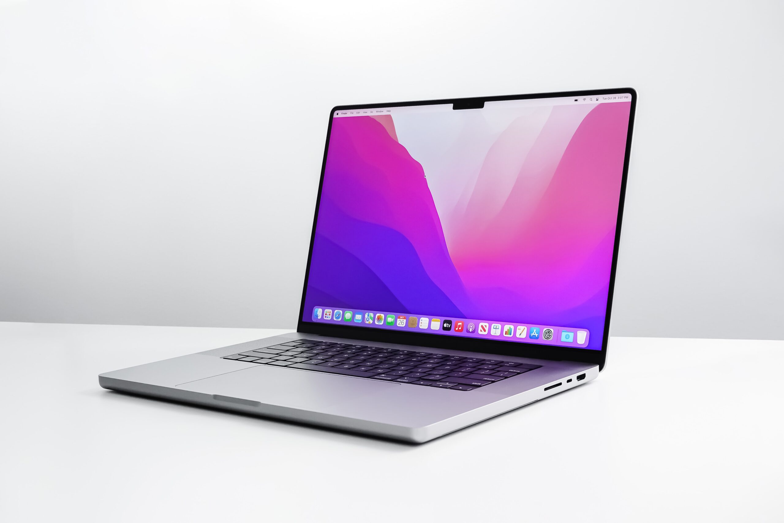
Basically, some Status bar icons, such as Apple’s battery indicator, can get hidden by the notch when menu bar items are extended. The author of this article concludes that there is no guidance to developers from Apple to solve the issue.
Not a Solution But a Way Around: Display Menu
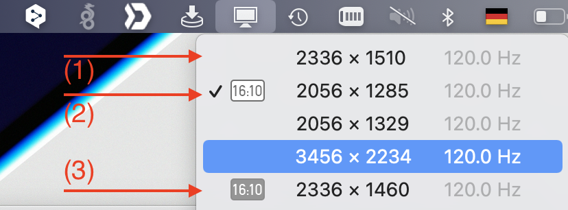
The very flexible tool Display Menu shows a way around: just choose one of the standard Retina display resolutions. Display Menu, at least when choosing the paid option (in-App purchase for 1,99 €) offers three types of resolutions to which it can set your display.

The notch based type of screen resolutions (1) are a special screen resolution invented by Apple which makes use of the space left and right from the notch. The resolution figures for this type of screen resolutions are rather odd (2336 by 1510 in the example above). Apple specifying these displays as „16.2“ (instead of 16″, in my case). If you have many menu bar items right from the notch together with a rather rough resolution, you run into the risk of icons being hidden under the notch. If however, you select one of the resolutions of type Retina (2) or non-Retina (3), which are based on plain 16″ displays, the menu bar will be positioned fully under the notch, like in conventional displays. You will, however, ‚loose‘ the additional space left and right from the notch.
I don’t know any other means to force the screen of the new MacBooks with a notch to be switched to specific Retina or non-Retina resolutions (avoiding the notch) from the system settings, built into macOS. Hence, my recommendation, go for Display Menu.
